Sunday, 28 April 2013
Evaluation Question 3
Generally films or genres tend to have a certain audience category that they seem to appeal to.
After I had filmed and edited my trailer, I wanted to show it to a few people of both gender that fit into devised age groups to try to find the audience that would be best suited for my film.
I feel it is a great thing to get audience feedback as it can definitely help you grow as a creative artist, and better your future projects. For example after receiving this audience feedback I will have a better idea of which audience category wants from a film.
Lets see what they thought!...

My Dad didn't seem too sure about the trailer. He enjoyed the horror and tension but was not a fan of the protagonist. Perhaps this is because of the age and gender difference therefore she was un-relatable for a middle age man.
* * *

My Mum was not a fan of the trailer at all! She jumped throughout and hid her head at the end. She said this was not personal to my trailer as she doesn't like horror films in general, so a middle aged woman is not the demographic that we are aiming for with horror in future.
* * *

Eve liked it a lot! It was right up her street and it actually made her associate the film with real life situations like she said it makes her "not want to move into her own flat". She perhaps found it more sinister as the protagonist is her age and therefore relatable.
* * *


Liam enjoyed the trailer, but would have preferred one with more action and blood and gore. He did like the horror parts but prefers slasher films to subtle supernatural horrors.
* * *
Having said this, this is not set in stone. All ages and both genders enjoy a variety of film and it does often depend on the person, therefore we would not rule out advertising around a broad audience.
Evaluation Question 2
When I started working on my auxiliary texts I wanted it to be obvious that there was a clear link between them and that the theme was consistent so the audience could get a good feel for the film from all three products and see the link. I felt this was vital as this is what would occur with the promotion of a real media project and I wanted it to look as professional as possible.
The three products definitely complimented each other in that they all gave off different parts of information about the main film, but very little information.
For the mag cover and poster, they both have different images on them as I wanted to vary the information given to the audience.

For the mag cover and poster, they both have different images on them as I wanted to vary the information given to the audience.

The mag cover has an image of just Hermione's face with her eyes blacked out in a scratched effect to give a creepy effect.
This introduces the potential film audience to Hermione's character and give information about our villain, like she is a girl, without giving too much away. I decided to show just her face and put the picture in greyscale, not only to make her look impending and eerie, but to add suspense, and not give her away too much as a character.
<- original image
 The poster image like I said is very different and here displays the fact that the setting is in a cellar, with the drap door opening and hand coming forward.
With this picture you see no face so it gives off very little about the character, but rather focuses on the setting and thy mystery of the film.
I used the same font for the title 'INTRUDER' to give it a continuous film and to confirm that it was not a different film advert if someone sees the poster and magazine cover individually. Its important that the potential audience associate the font with the project all together.
I chose to make both ancillary tasks black and white as it reflects the darkness of the trailer and storyline as well as bring suspense and mystery. I didn't want to do the whole trailer in black and white, so I adapted this by doing it with low lighting to still give it a dark edge. I did this as I didn't want the audience to think that the entire film is black and white, as with modern films this is not popular so I did not wish to put them off watching the main film.
This introduces the potential film audience to Hermione's character and give information about our villain, like she is a girl, without giving too much away. I decided to show just her face and put the picture in greyscale, not only to make her look impending and eerie, but to add suspense, and not give her away too much as a character.
<- original image

With this picture you see no face so it gives off very little about the character, but rather focuses on the setting and thy mystery of the film.
I used the same font for the title 'INTRUDER' to give it a continuous film and to confirm that it was not a different film advert if someone sees the poster and magazine cover individually. Its important that the potential audience associate the font with the project all together.
I chose to make both ancillary tasks black and white as it reflects the darkness of the trailer and storyline as well as bring suspense and mystery. I didn't want to do the whole trailer in black and white, so I adapted this by doing it with low lighting to still give it a dark edge. I did this as I didn't want the audience to think that the entire film is black and white, as with modern films this is not popular so I did not wish to put them off watching the main film.
Essentially, my two ancillary tasks are there to promote my main film. For promotion to be a success, it is vital that the audience would link the two tasked together and they enjoy both parts of the cohesion. This is why I tried to make them different in their own way, so the audience would see something new with each task and not be bored with one or other.
To conclude, I feel I have created effective promotion material for my main project and used good continual aspects such as greyscale colouring and font, to keep it continuous. I think my three pieces compliment one and other and fit well as one rather than individually.
FINAL MAGAZINE COVER
I wasn't happy with my initial magazine cover design so decided to do a fresh one with my own footage and I am pleased with how it turned out.
I used publisher to create the poster then to edit the main image I used PAINT.
Genre Analysis
Genre, in film theory refers to the method based on similarities in the narrative elements from which films are constructed. They are then classified into files or genres. Some popular genres in Hollywood include Comedy, Chick flick, Horror, Teen, Musicals, Drama etc.
Films are also be subdivided by their characteristics and the content shown in the film. For example: Family movies, children’s film , cult films and silent films. Genres are basically used by film makers to appeal to different audiences classified by either Age, ethical background, region etc.
My film has the genre of “Horror” with a slight sub-genre of “supernatural - horror”. Below is a slideshare presentation of horror sub-genres and how i came to the conclusion about my subgenre.
Conventions of the genre are vital when making my trailer. The conventions of a horror genres specifically are particularly obvious however can be difficult to do and put across well. If I want to make a sucessful trailer I would have to be sure to include as many conventions as I can as well as doing plently of research so that it look as proffesional as possible.
Cinematography
Dark scenes are very typical of horrors. The lighting and filtering can make a scene or even photograph look entirelly different and make the horror aspects very effective. Eerie visuals is always important to set the scene.
Location
Location is vital to a horror film. Isolation is key, making the audience feel like the character or characters are on their own making them more helpless or vulnerable. for example, cellars, old houses, asylums.
Camera Work
POV shots make the film more intimate by giving the audience a sense of what the character is going through and allowing them to see through their eyes.
Depth of field allows things to approach the camera slowly therefore causing suspense.
Handheld shots can help disorientate the audience and again make them feel like they are in the character shoes.
Sound
With a horror film, audio is arguably the most important aspect when editing. The sound can almost make something visually terrifying funny, or the other way round - something visually not ovely impressive terrifying.
- Exaggerated diegetic sound will allow tension to build (such as cellars slamming, footsteps or creaking floorboards)
- Fast and loud non diegetic sound can add to making the audience jump or feel scared I.e. the music in the shower scene in Psycho.
Saturday, 27 April 2013
Summary of Shooting Day 2
15th January 2013:
Now that we had both our characters with us we could start the main filming.
It was a long day but very successful We did the outside shots first so that we had light, and then proceded to do the inside shots. I am definitely happy with how the day went and the actors responded really well to direction and I am looking forward to editing the footage!
I also took various shots of the setting and characters for the poster ans magazine cover too.
Summary of Shooting Day 1
7th January 2013:
Today was spent analysing the setting and making sure that we had everything we needed, in regards to props and equipment. We took a few tester shots although I dont think we will use them all in the final trailer.
It was a success in that our protagonist now has a real feel of where she will be filming and can now go away and think about how she will do things and all the restrictions we thought we had at the beginning of the day, (ie we had to clear out the cellar completely and add broken bottles etc) have now been eliminated.
The setting and equipment is now completely set up ready for filming when our character who plays the villain gets back from her holiday next week.
Film Age Rating - 15
After looking at the content and theme of my trailer and storyline, I have decided that it should be rated as a 15.
I got the criteria for what is and what is not acceptable for a film of certificate 15 off of the official bbfc website. I have highlighted the topics that may apply to my film.
 15 –
15 –
Suitable only for 15 years
and over
No one younger than 15 may
see a ‘15’ film in a cinema.
No one younger than 15 may
rent or buy a ‘15’ rated
video work.
Discrimination
The work as a whole must not endorse discriminatory language or behaviour.
Drugs
Drug taking may be shown but the film as a whole must notpromote or encourage drug misuse. The misuse of easily accessible and highly dangerous substances (for example,aerosols or solvents) is unlikely to be acceptable.
Horror
Strong threat and menace are permitted unless sadistic or sexualised.
Imitable behaviour
Dangerous behaviour (for example, hanging, suicide and self-harming) should not dwell on detail which could be copied. Easily accessible weapons should not be glamorised.
Nudity
Nudity may be allowed in a sexual context but withoutstrong detail. There are no constraints on nudity in a non-sexual or educational context.
Sex
Sexual activity may be portrayed without strong detail.There may be strong verbal references to sexual behaviour,but the strongest references are unlikely to be acceptable
unless justified by context. Works whose primary purpose is sexual arousal or stimulation are unlikely to be acceptable.
Language
There may be frequent use of strong language (for example, ‘fuck’ or 'shit'). The strongest terms (for example, ‘cunt’) may be acceptable if justified by the context. Aggressive or repeated use of the strongest language is unlikely to be acceptable.
Theme
No theme is prohibited, provided the treatment is appropriate for 15 year olds.
Violence
Violence may be strong but should not dwell on the infliction of pain or injury. The strongest gory images are unlikely to be acceptable. Strong sadistic or sexualised violence is also unlikely to be acceptable.
There may be detailed verbal references to sexual violence but any portrayal of sexual violence must be discreet and have a strong contextual justification.
Wednesday, 24 April 2013
FINAL FILM POSTER

I decided to take a whole knew approach for my film poster because all the images used for my initial poster were from the internet.
Due to the fact that we had not begun filming I had no images myself for a poster so once we began filming i took some pictures of our protagonist that I thought would look appropriate for a poster.
After doing research on Horror film posters, I found that a common element in horror film posters is one main striking image. I chose this image as i think the angle and action is fairly impending and almost threatening, with the arm reaching towards the camera, which is good for a horror genre poster.
I chose the tag line 'you're never safe in your own home' because it fits the story line without giving too much of the film away. I also felt it would be eerie to a viewer as any person's home is supposed to be a sanctuary and safe place, so if that is not safe, where is?
I used the website ->
for the font as it is a good website for designing the font to the colour and style you like.
Tuesday, 23 April 2013
Horror Poster Analysis - The Uninvited

This poster demonstrates typical film poster conventions such as...


- This poster has one large focusing image that is fairly invasive and seems as if the person is looking onto the viewer to give it an eerie and uncomfortable feel. This is common in horror posters as they tend to have one main image rather than many small ones to not give too much away of the film.
- The lighting in the poster is low and the characters face is shadowed. This again is not uncommon for a horror poster as the shadow over the girls face is to give her mystery, as people often fear the unknown.
- The colour scheme in this poster is black and white or greyscale. This again must demonstrate the darkness of the film itself as well as to keep the mystery and suspense intact. The fog behind the character pressed against the window also creates suspense as it is typically difficult to see through fog, therefore anything could be lurking in its midst.
- The title is somewhat small and in a distorted font. This distortion could reflect the distorted events within the plot, and the fact that it is small makes us focus on the picture more.
- The fact that there is a caption on the poster stating that the film is 'from the producers of 'the ring' and 'disturbia'', shows the promotion of the film. 'The Ring' and 'Disturbia' were popular horror films in their own right therefore this film should follow that success.
Props used in our trailer
Cellar props:
Old Bottles:

Already in the cellar was a few boxes of old dusty and some broken bottles. We decided to scatter them around the cellar but in some order so it almost looked as though they had been used not too long ago. The good thing about old bottles is that not only could they have been an indicator of life in the cellar, but they are also glass, so could be dangerous (broken bottles).
Bed area:

We tried to make a corner of the cellar look like a sort of bed set up to emphasize the idea of someone living in the cellar. We made the 'bed' very minimal, with an old, screwed up blanket as a pillow with no cover, only a rug to sleep on. This gives the idea of the villain to be somewhat 'unhuman' in that doesn't need to simple human pleasures like a duvet.
pillow :

Old photos:

We also found a lot of old photos in the cellar when we first explored it which we tried to incorporate in our film. We scattered some over the bed and stuck some on the wall to show that the villain took an interest in the photos or perhaps took them themself .
Final location choice for trailer - Keeley's lower floor
After our lack of success filming in the abandoned college, Keeley and I found somewhere to film much closer to home... In Keeley's home!
The house itself is very old and used to flats, so the lower floor has a kitchen which isn't used so it was perfect for our trailer. It also has a cellar which is a very stereotypical location for a horror film so we thought we would incorporate that too.

^ kitchen area
The only indication that shows the protagonist is in a new home, other than when she speaks of it on the phone with her Mum, is when she is seen washing up in the kitchen. This is an indication as it looks very run down and there are very few homely belongings in the photo. There are boxes surrounding her making it seem as though she has just moved in and has not unpacked
yet.
The main location that our trailer is filmed in is the cellar that our protagonist discovers during the trailer.

Cellar from the entrance ^
The cellar is a very good location we felt as Keeley and I were the first people to go in the cellar since her family moved to the house so we found lots of old belongings owned by the previous family who lived in the house. This for us in itself was very creepy so it seemed the perfect place to film a horror!

View of steps from inside the cellar ^
As is shown in this picture, the cellar is very dusty and old-looking and not decorated in the slightest. We removed some of the old belongings to make it seem more empty and moved anything that looked modern, such as some carrier bags lying around.

^ Walkway to the main cellar room (where Keeley is standing)
You can see in this picture as well as the previous one some rusty pipe and electrical work which we liked as it looked somewhat dangerous and rusty adding to the unnatural nature of the cellar.

This room is the main room of the cellar which we used as the living space of the 'villain' of our film. The lighting is effective in this room as it is a singular light bulb that doesn't give off a huge amount of light leaving some corners dark.
Although the hole in the wall that you can see is actually blocked, that is not obvious in the footage so could be thought to be a secret passageway, again another standard feature of a horror movie.
Protagonists - Molly and Hermione
The only two characters seen in the trailer are the protagonist and the villain (person in the cellar).
We have chosen two of our friends to portray these characters for us and chose the based on the fact that they both do drama at A-Level and they are also close friends of ours so we would be comfortable giving them instructions and they are used to being directed and are practiced actresses.
Molly - Protagonist:
We chose Molly to be our main character as there is a certain innocence about her look and she has a natural as well as mature look, like that of a student or young lady. We thought these characteristics would be ideal as our protagonist's back story is that she has just moved out of her parents house and this is her first house alone. Therefore she is naive to living alone and is just starting her life and gaining her independence.
These characteristics are fairly typical of the horror genre as there is often a "damsel in distress" type of character that is weak and perhaps foolish. Molly's character is true to this stereotype to a certain extent, although she does live alone and there is no standard "knight in shining armour" to save her, so whatever situation she might find herself in, she must get herself out of. Here is one of the ways our film differs from other horrors.
Hermione - Villain:
We chose Hermione to act as our villain as she has a particular knack for playing supernatural and eerie characters. She also has a specific look that can be distorted with the right make up and look quite frightening.
Hermione's character's look is of slight innocence, much like Molly's although it is distorted with make up and facial expressions into a more sinister and creepy look. We thought this would be effective, as then our protagonist and villain would have an odd similarity as well as vast contrasts. Also they are of the same age and gender which is another similarity. This may make the audience ask questions such as "what must have happened in these girls pasts for them to have turned out so differently from each other?"

Magazine cover - drawn flat plan and template
In class we were given the template below to use to refer to when creating a flat plan for our beginning ideas for our magazine cover.
This was helpful in addition because it contained all of the technical terminology for a magazine layout such as masthead and coverlines. We can now use these when referring to them in our coursework .
This is my flat plan draft -

As you can see my artistic skills are not very good therefore I just did stick figures to represent the actual photos or digital images that will replace them in the real poster.
In order to make it look like a magazine, I tried to add all of the standard magazine conventions, for example i had a column of coverlines, incentives and a barcode. I feel these features made my magazine cover as authentic as possible.
Original location for filming - abandoned college
We dabbled with the idea of a few locations to film our trailer, taking into account the story line and genre and what would look good and effectively stage our plot in the way we wanted.
Originally we wanted to film it at the abandoned Hastings College. It has not been used for many years and we felt it would be ideal because in our plot we wanted our protagonist to have just moved to a run down house or flat that looked old and had a creepy feel to it (keeping with the horror genre).

The abandoned college ^
Our original idea was to use a section of the college to film in so it looked like our protagonist was living in a smaller house, as she is young and realistically wouldn't afford a huge house.
After visiting the site to try to establish what parts we would film in and to get an idea of props and such, we saw it was in very bad condition and looked very dangerous to enter. For our own safety we decided it was not a good idea to film in there as well as we later found out it would have been illegal anyway.
Wednesday, 10 April 2013
Halfway through project - evaluation
As we are halfway through our project, our media teacher gave us a few questions to answer to see where we are at with our project and do an evaluation to ensure that we are on track and progressing well.


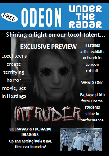
Initial magazine cover promoting our film

This is my final draft for a magazine cover. I decided to make it a free magazine from our local cinema because our film is very low budget and not highly promoted therefore it wouldn't be picked up by any major magazines such as Empire or Total Film.
I used words such as 'terrifying' to promote the films genre, and to promote the film itself the coverline 'Local film preview special!' to make it sound exciting, and as if it is an exclusive insight into the new film.
I used dark colours to try and stick to the theme of the film to some extent, as well as trying to make them fairly neutral so that because my film wouldn't be on the cover every week, these colours will work well with all types of film poster or cover that could be advertised on it in the future.
CHANGES:
I have made some changes to the magazine cover from the flat plan. For example the flat plans' magazine title is 'Local Talent'. Due to the fact that the magazine had to specifically be a film magazine I changed the name to 'ODEON - Under the Radar' to still give it the same local, lower budget feel, but incorporating the film aspect.
Also the poster looks a little different and this is because I hadn't created the poster when I made my drawn flat plan, and I changed the idea when coming to make the main poster.
I also made the caption that is shown below the drawn flat plan in a plug rather than a caption because i felt that this fitted the cover better and made it look more authentic.
Initial poster for our film
This is my initial poster idea for my film. I wanted the poster to be simple and not have too much detail because I want the film to keep a mysterious feel to it so that the audience has to watch the film if they want more detail.
The caption "They wont let you leave" is very cold and direct without any room for compromise, which is the feel i wanted to give the film in general... a pure horror film with seemingly no way out.

I think that the poster could be improved as it looks a little too much like a DVD cover at the moment and not so much like a promotive poster, but as this is only a first draft I will do another version at a later date.
Subscribe to:
Comments (Atom)